
Product Design
Premise
A client in the mobile rehabilitative therapy space approached us with a critical workflow gap. Therapists were relying on insecure text messaging to share patient details and using paper documentation stored at the patient’s home, which introduced privacy risks and inefficiencies. Additionally, the client was missing revenue opportunities due to therapists not having a way to capture travel time and miles traveled between patients.
Our goal: Design a mobile, offline-capable documentation tool that supports secure data entry and streamlined workflows for physical therapists on the go.
Research Goals
I set out to understand:
How therapists manage patient documentation while on the road
What information is most critical to patient visits and how it's prioritized
Which technical, legal, and contextual constraints needed to be accounted for in our solution
JTBDs
As an onsite physical therapy provider, I need to text patient information to my colleagues so that I can get information from same-day appointments with my patient because I work on the road and don’t have access to a computer between patients.
As an onsite physical therapy provider, I need to do all my notes at the end of the day so that I can do them in front of my computer at home because I am driving from one patient to the next and don’t always have time to document between patients.
Approach
To kick off the project, I organized and facilitated a cross-functional design thinking workshop. I was intentional about assembling the right mix of stakeholders to ensure all relevant perspectives were represented. Participants included:
Engineers to assess feasibility
A product manager with a strong relationship with the development team
An account manager who knew the client well and could advocate for their priorities
A UX designer for design collaboration
An internal MD consultant to ensure clinical relevance
An internal stakeholder to ensure business needs were being met.
The structure of the workshop largely followed Jake Knapp’s Design Sprint method. I designed the activities to align the team on the core problem, explore a wide range of creative solutions—including some intentionally “unrealistic” ones—and ultimately converge on a pragmatic, technically feasible direction.
This collaborative session created strong alignment early on. Engineering stakeholders helped us course-correct ideas based on technical feasibility, clinical advisors grounded our concepts in real user needs, and product leadership ensured business alignment. We left the workshop with a shared understanding of the constraints and a working hypothesis we could bring to end users: a secure, offline-capable tablet app for in-home clinicians.

Information Architecture
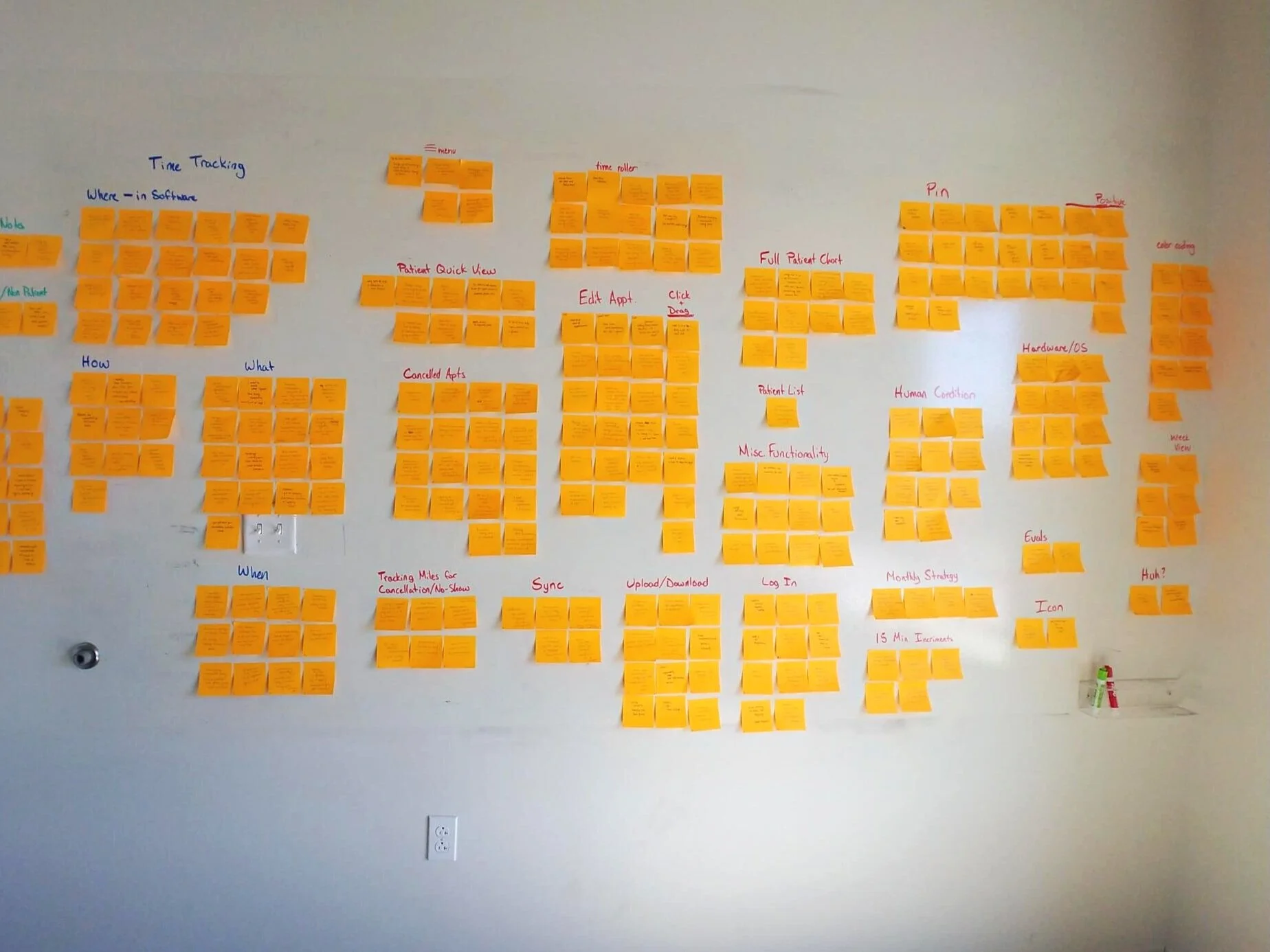
Before jumping into structure, I initiated a generative research survey with clinicians, made possible by our account manager and their strong relationship with the client. This gave us direct access to prospective users and a more honest pulse on their needs. I synthesized those survey results and insights from the workshop using affinity mapping to organize user goals, workflows, and pain points.
From there, I developed a hypothesis for the information architecture, guided by the Jobs-To-Be-Done identified earlier. This first iteration helped define how clinicians would navigate core tasks—like viewing a patient schedule or documenting visit notes—while balancing simplicity and scalability.


Prototyping & Iteration
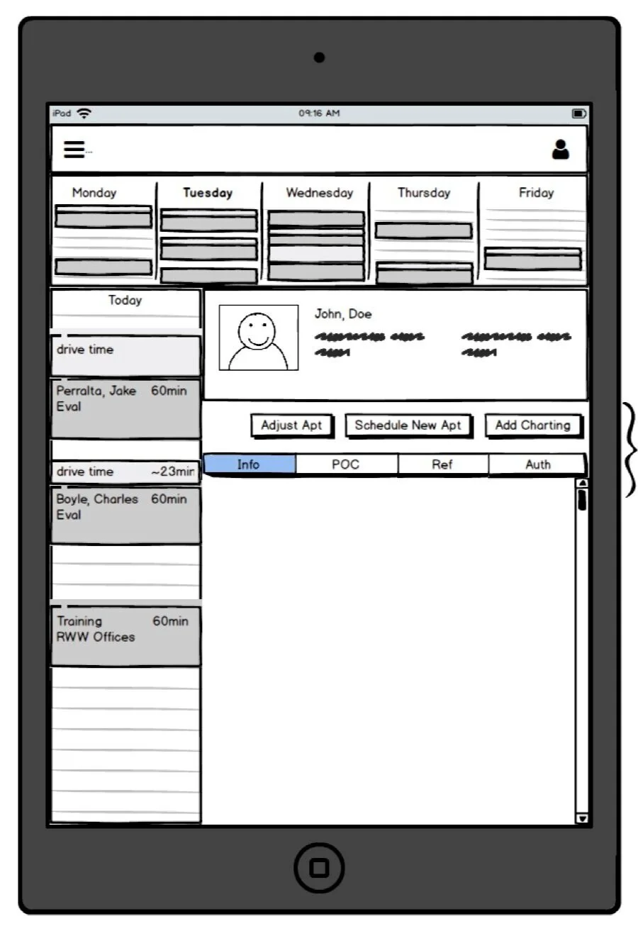
I led the creation of low-fidelity prototypes, favoring whiteboarding and quick sketching to rapidly align on early concepts and encourage feedback before investing in visuals. Once we had directional confidence, I transitioned into mid- and high-fidelity prototypes in Figma, leveraging our internal Design Language System to accelerate consistency and reduce design & tech debt.

About a year prior to this project the UX team decided it was a business priority to create a company Design Language System. As a result, I was able to reduce time in the mid-fi prototype stage and quickly assemble a high-fi prototype leveraging our DLS components in figma.
Usability Testing & Iterative Refinement
Over three rounds of remote usability testing, I validated and iterated on our solution via 1:1 remote interviews. We tested with 5 new participants per iteration. I used a combination of:
System Usability Scale (SUS)
Net Promoter Score (NPS)
Single Ease Question (SEQ)
Moderated task-based questions
Key finding from Round 1: While the core Jobs-To-Be-Done were accurate, users prioritized patient information differently than internal stakeholders assumed.
To dig deeper, I introduced a card sorting activity in Round 2, which helped me surface how clinicians expected to see patient data structured. This insight led to a pivotal design decision: defaulting to the patient’s schedule rather than their note history, which better mirrored clinicians’ mental models and improved task efficiency.


Field Testing & Deployment Readiness
After development, I facilitated an on-site usability test in WellSky’s newly built UX lab, giving us a rare opportunity to observe real users interact with the product in a controlled yet realistic environment. These sessions helped us identify last-mile refinements before going live.
Curious how the lab came to be? Read the case study about launching the UX Research Lab here.
Impact
Enabled secure, efficient documentation in offline environments
Reduced risk from unsecured communication and paper documentation
Enhanced clinical workflows with an interface tailored to field use
Delivered quantifiable usability insights that gave the product team confidence ahead of deployment
Strengthened our client relationship through deep collaboration and transparency throughout the process
Evangelize UX internally to the Product Manager on this project who later went on to be a champion for UX within the Product & Engineering department at WellSky